We have built this dashboard to enable local governments, communities, and workplaces to enact locally appropriate health- and economic-protective policies for workers during this period of economic recovery. This dashboard will provide specific information about occupational risk factors and a county level COVID and unemployment assessment.
How to Use This Dashboard
This dashboard will be useful for county and local governments, employers and workers. Using the data and visualizations on the dashboards, you can determine current workplace risk for an occupation in a specific county in regards to the local COVID risk.
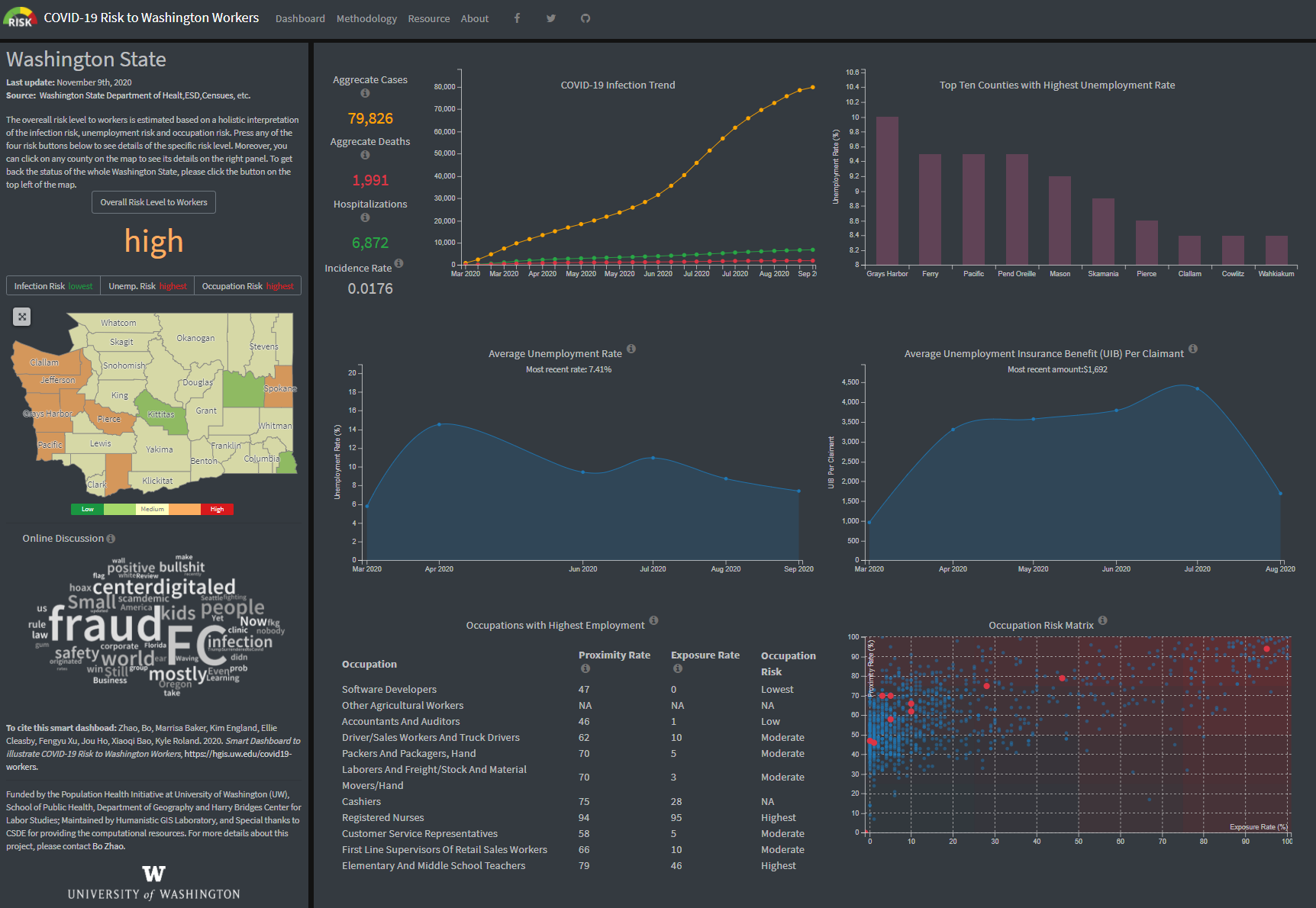
On the dashboard page, you will be immediately directed to a choropleth map which shows our overall risk matrix for each county. This matrix was calculated by... This map view can be changed to view infection risk, unemployment risk, and occupation risk, by clicking on the appropriate tap above the map. On the dashboard you will see infographics which show COVID risk and unemployment over time, and occupational risk at the state level. From this map, you can click on a county and see six infographics. These infographics are:
- a line graph showing COVID-19 cases, COVID-19 deaths and number of hospitalizations associated with COVID-19 within that county.
- a wordcloud which summarizes key terms which appeared in social media content about COVID-19 in that county.
- a line graph showing the unemployment rate in that county throughout 2020.
- the most recent unemployment insurance benefit per claimant in the county.
- a ranking of the 10 occupations which are currently hiring the most in that county.
- a scatterplot showing occupational risk. This scatterplot takes data from the Bureau of Labor Statistics which calculates exposure to disease or infections and physical proximity on a scale of 0-100. Across the x-axis is exposure to disease or infections ("How often does this job require exposure to disease/infections?"), and across the y-axis is ("To what extent does this job require the worker to perform job tasks in close physical proximity to other people?"). You can use the drop-down menu to choose an occupation and see the risk level. Or you can hover over points on the scatter plot to see what occupation it represents.
More information about how these data are collected, processed and visualized are explained and can be accessed in the methodology page.
Team Members

Dr. Bo Zhao
Primary Investigator
Dr. Marissa Baker
Co-PI
Dr. Kim England
Co-PI
Ellie Cleasby
Labor Study Researcher
Fengyu Xu
Lead WebGIS Developer"As the project's student leader, I created the main skeleton, functions as well as the styles for the website. Meanwhile, I am responsible of the infection, overall and occupation(work with Kyle) risks' anlysis and visualization."

Steven Bao
Web developerMainly on data collection, processing, and visualization for the unemployment-related statistics used in the dashboard. Meanwhile assisted Fengyu in the infection data processing and visualization. Also worked on some minor bug fixes.

Jou Ho
Web developerWrote Python scripts to collect Twitter Data and using the data to generate wrod cloud as well as sentiment intensity score. Also contributed in the development of the "methodology", "resource", and "about" page.

Kyle Roland
Web developerDeveloped a high-fidelity prototype for the dashboard and contributed to front-end implementation with a focus on Occupational Risk.

Yuke Cao
Web developerContributed in developing "resource" page and sentiment chart. Helped with maintenance of website and debug.
Acknowledgement
Funded by the Population Health Initiative at University of Washington (UW), School of Public Health, Department of Geography and the Harry Bridges Center for Labor Studies;
Hosted upon the server offered by UW's Center for Studies in Demography and Ecology (CSDE);
Maintained by the UW's Humanistic GIS Laboratory. For more details about this project, please contact Bo Zhao.
